case study
UI Design for Savvy
Imagine the perfect hybrid between Linkedin and Tinder - a place where business people can discover and connect with more professionals in their field based on a matching system. Savvy was a concept motivated by the idea of allowing more streamlined recruiting processes. Often recruiters and jobseekers alike reach out to each other and it ends up not being completely compatible - either skills don't quite measure up or motivations don't align.Savvy is a system meant to bridge that gap. By only being able to see and contact a candidate when you know that they are the right fit, you are able to save time and resources either as the hiring manager of a company, or as a third party recruiter.Sadly the project never made it to the development phase, but the interface is still one of my favourites out of all the projects I've worked on so far and the client is kind enough to allow me to use it for showcasing purposes.
UI Design
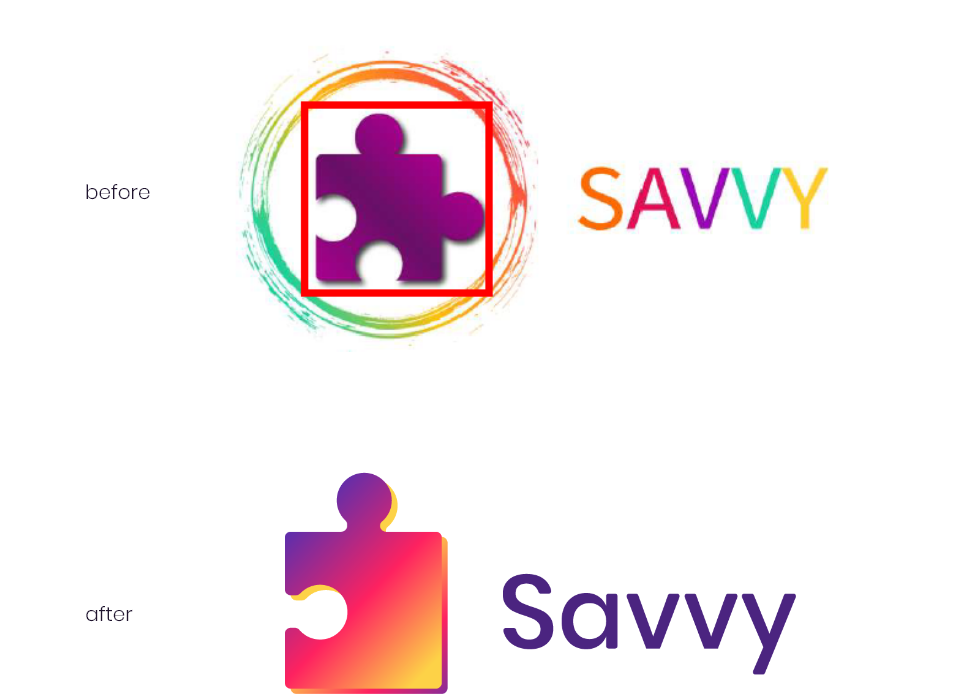
Savvy Brand
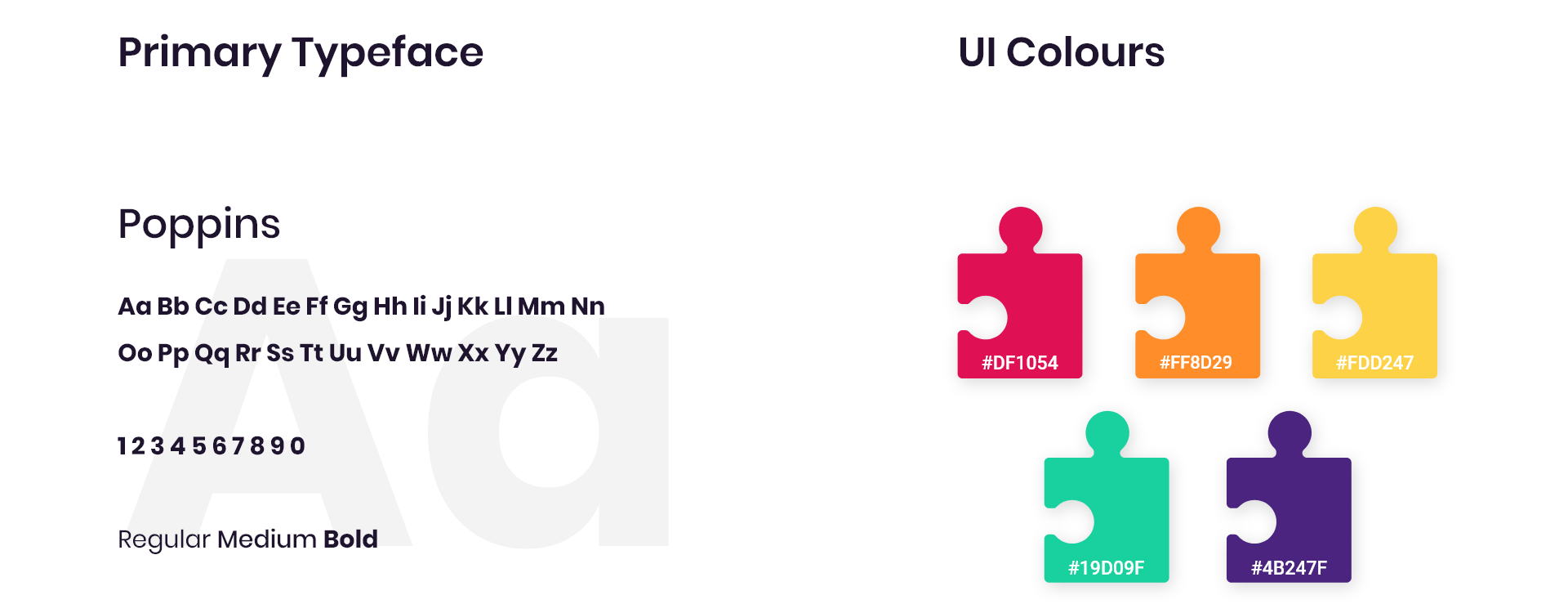
The client was the sort who already knew exactly what she wanted. That, accompanied by the UX research done already by my predecessor for the project, allowed me to focus solely on the visual side of it. She knew exactly how she wanted the user journey to flow and even went so far as to supply me with all the necessary colours and references.The puzzle piece logo represents the perfect fitting of candidate and agency, and the client wanted to retain that, but give it a more modern and clean look since, previously, some of the detail would get lost at smaller sizes.Poppins was the font we settled on for the logo and decided to carry it through to the interface as well. It gives that clean, minimal look with a touch of femininity, just to accentuate the approachability the system was meant to convey.
UI Design
Front End Design


UI Design


